Mastering Color Theory for Web Design – The Easy Way

4 min read
In this post I want to share with you how I approach color design in my web and mobile app designs.
I used to stress over how to pick colors, what works, what doesn’t, what shows contrast, is it accessible…. Ahhhh!
And how do I even apply concepts like Complementary and Analogous colors? I get the theory, but how do I make it real?
I’ve since found an AMAZING way to do this thanks to Dan Romero (@bydanromero) on Instagram.
It uses the HSL values (Hue, Saturation, and Lightness) to help you make your color design decisions. (Sometimes HSL is written as HSB - Hue, Saturation, Brightness).
From my understanding, this concept is also used in picking out colors for interior design. Another industry where color is extremely important to the end result.
This method removes thinking and exhausting decision-making from the equation and lets you get started on your project faster.
Today I’ll walk you through it:
Picking your Primary Color
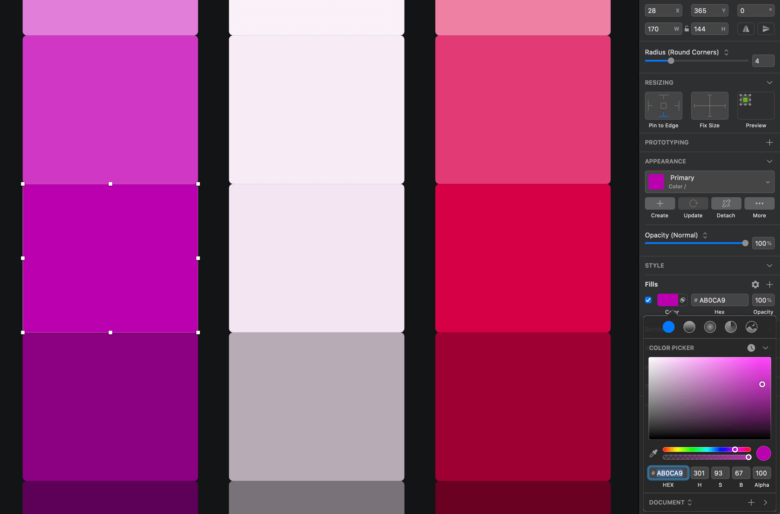
Step 1: Pick your primary color.
Typically, when you’re working with your brand or your client’s brand, you’ll already have the primary color picked out. If not, pick one and get started.
We’ll start with the Hue, Saturation, and Lightness/Brightness values.
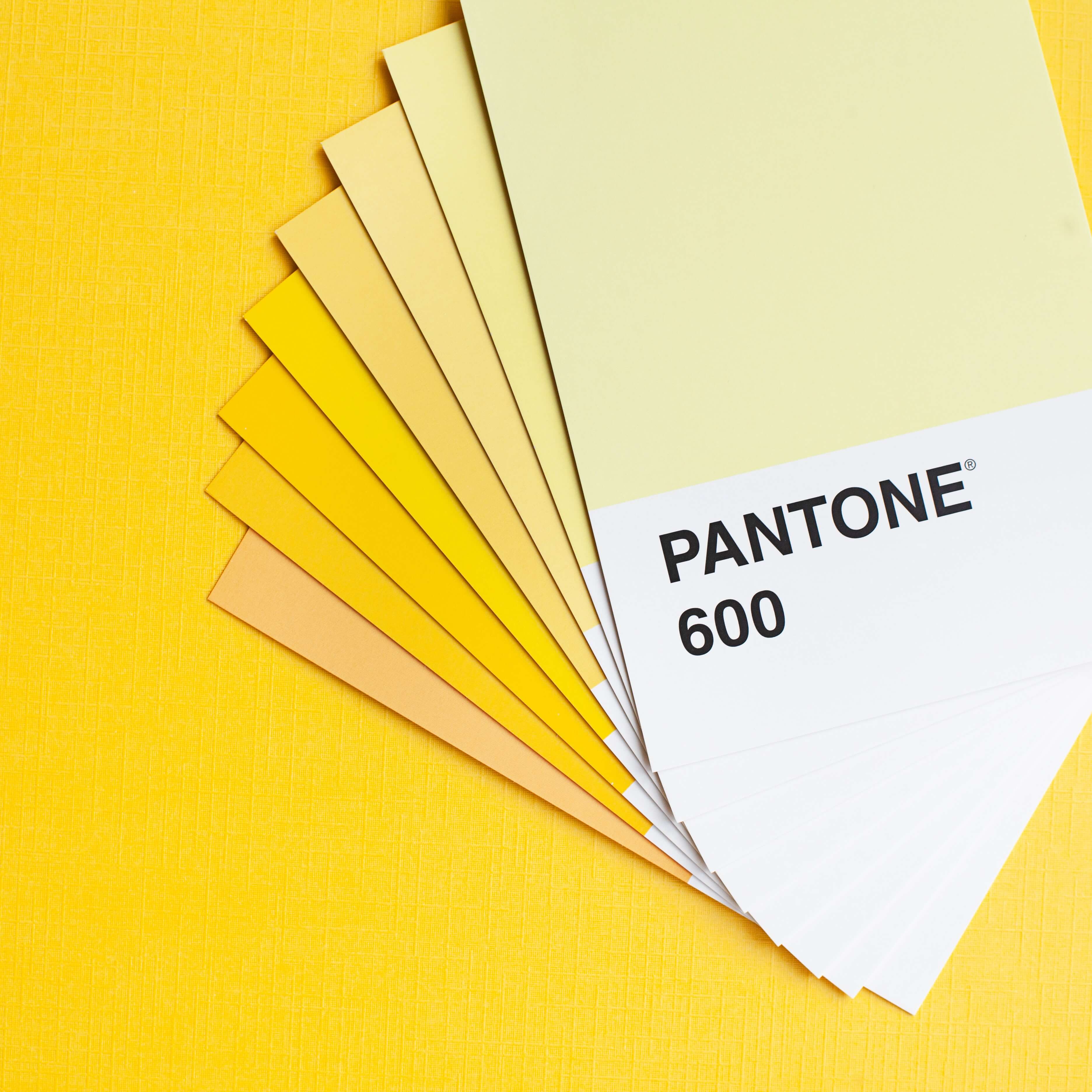
You can use tools like Adobe Color to play with these values.
Picking your Secondary Color
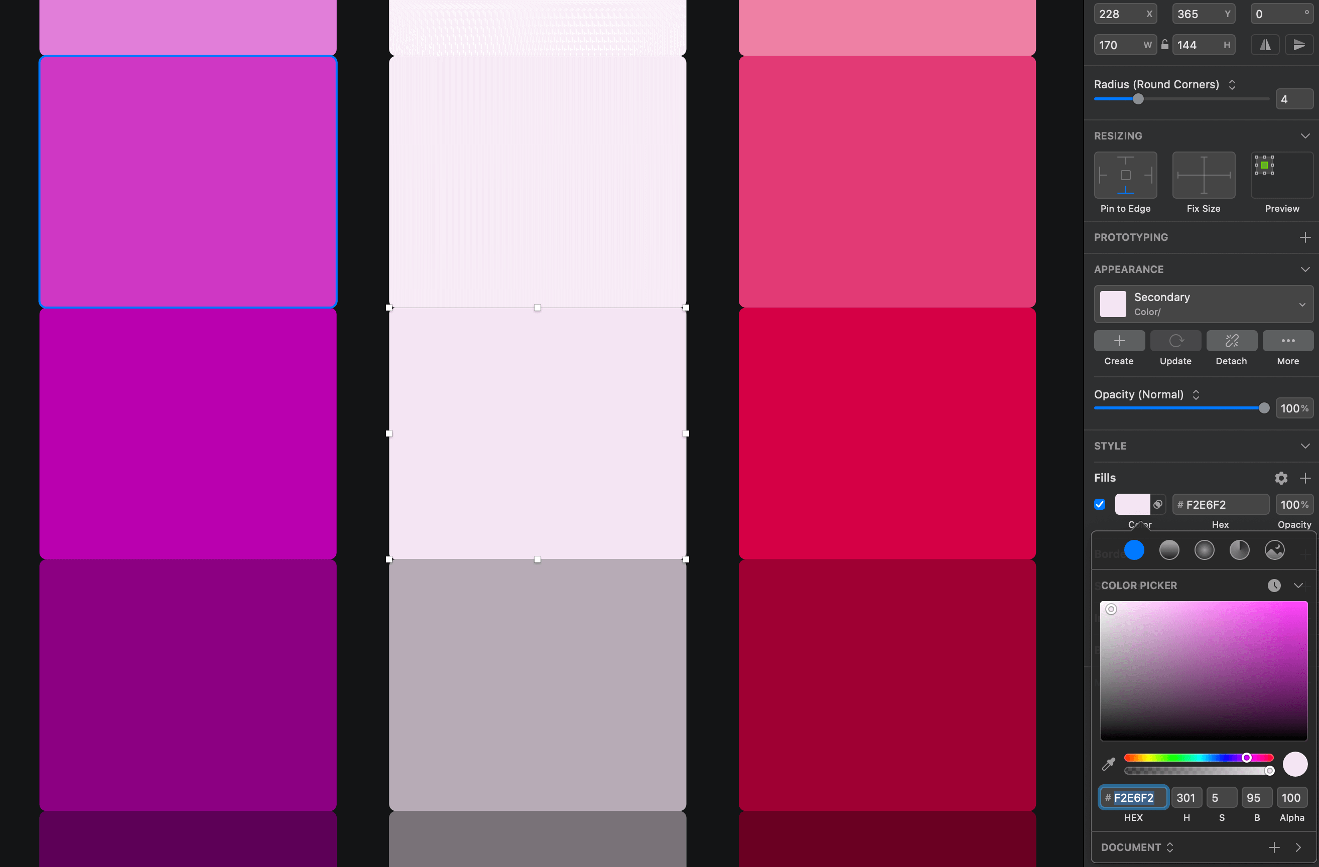
Step 2: Set your secondary color.
With your primary color loaded up, you’ll start with the Saturation value.
First, reduce the Saturation to somewhere between 5-10%. Doesn’t matter where; just start with something in that range.
Second, increase the Lightness/Brightness to somewhere between 95-100%. Again, doesn’t matter where, just pick one.
Play with the two ranges until you get a light color that you feel fits with your primary color.
Picking your Accent Color
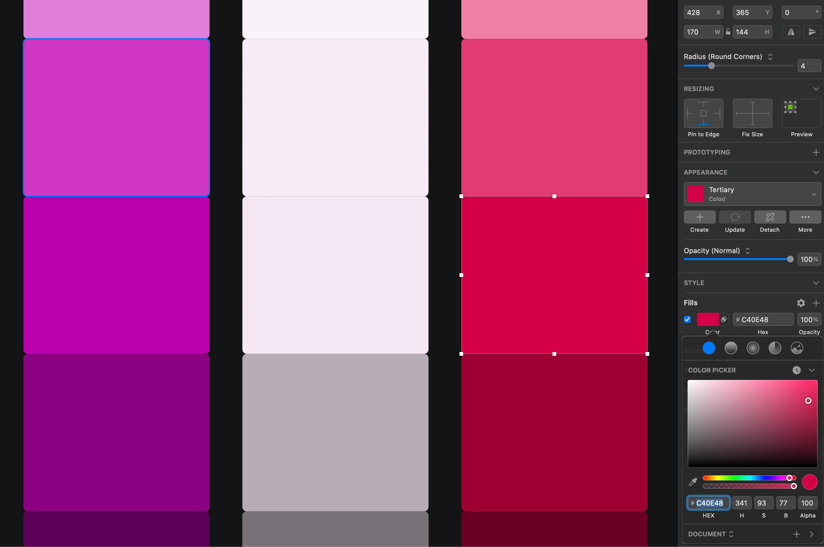
Step 3: Set your accent color.
The accent color is the one that will pop out when it’s placed next to your primary color.
Its purpose is to draw attention to button actions or important text in your design.
Take your primary color and adjust the Hue value up or down 30-40 points. Just find a color that feels great to you.
I sometimes push this value up or down to as much as 80 points to get the right fit, but rarely do I go beyond 40. Ultimately, it’s up to you.
Once set, you’ll then take your Lightness/Brightness value and increase it by 5-10%.
Play with the balance of these two values and, once you find your choice, you’re set.
Bonus: How to apply these colors to your design
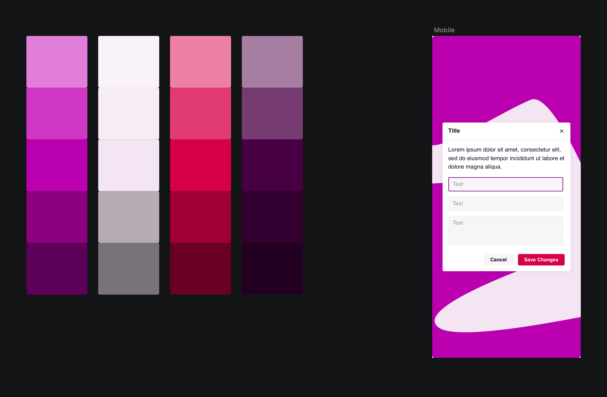
An example of how you can use this method in a real application
You have your 3-tone color palette. So how do you use these colors in your designs? And how much of a color should you use?
My recommendation: Stick to the 60-30-10 rule.
Use your primary color 60% of the time. This includes things like background fills, boxes, and anything taking up lots of screen space.
**Use your secondary color 30% of the time. **Think text containers, navigation backgrounds, and anything else that isn’t already being filled by your primary color.
**Use your accent color 10% of the time. **Think buttons, headings, bold text, and anything else that needs that eye-popping catch.

Colors are joy!
Remember that color design choices do not have to be scientific or mathematically correct.
In the end, it’s all about what looks and feels right for you and your brand, and that will ultimately make your web design or mobile app design look stunning.